Brain, whatcha doing?
An exercise in dimension reduction and mind reading.
I’ve been using the Muse EEG headsets and others off-and-on over the years. Analyzing my sleep, looking for ASMR moments while listening to music, and developing tools for the yearly EEG workshop I give at my former university.
The knowledge I’ve gained from dabbling with consumer-good EEG devices so far is, that the data you get is incredibly noisy and hard to interpret, that you basically can’t qualitatively compare data from different people, different headset models, and most often not even from the same person on different occasions.
YET STILL, I’ve always wanted to put together a little app that would guess my current activity, by having live EEG data move through a landscape of previously recorded and tagged datapoints.
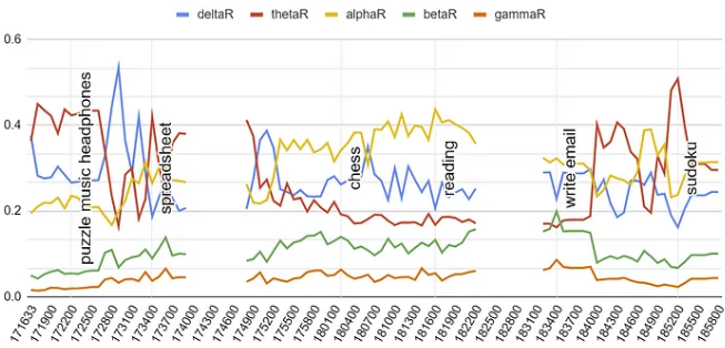 Continuous EEG recording over 2 hours, while switching between different activities. The gaps in the data indicate moments where the signal dropped, most likely due to me changing positions and causing the headset to move.
The Muse headset analyzes and divides your brainwaves into 5 frequency bands:
- DELTA (1–4Hz) … dreamless sleep, coma
- THETA (5–8Hz) … drowsy, dreams, trance states
- ALPHA (9–13Hz) … idle state, relaxed, meditation, eyes closed
- BETA (13–30Hz) … active thinking, alert
- GAMMA (30–50Hz) … hyper active, higher energy
Muse shares relative and absolute values for each of the frequency bands, but the absolute value are less interesting as the intensity of signal you’ll get (in microVolts) very much depends on how well the electrodes are placed on your skin, or how sweaty your forehead is. The relative values are more useful, as they put the focus on the changing dynamics between the individual frequency bands.
 I logged if I had my eyes closed or open, as that has a huge influence on the Alpha wave intensity.
The graph above shows how the different frequency waves slightly change based on activity. You notice how Delta/Theta/Alpha swap places for most intense frequency, while Beta and Gamma usually stay low and are pretty in sync.
Mind that the chosen activities here aren’t spectacularly different, as there’s a limit to what one can do while wearing a headset that should be held steady.
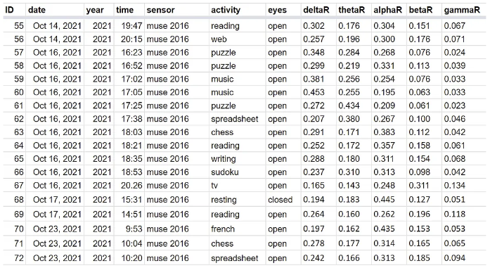
On the left a sample of what my dataset looks like.
All the values are averages over half-minute windows. (Muse outputs frequency bin information at a 10Hz interval).
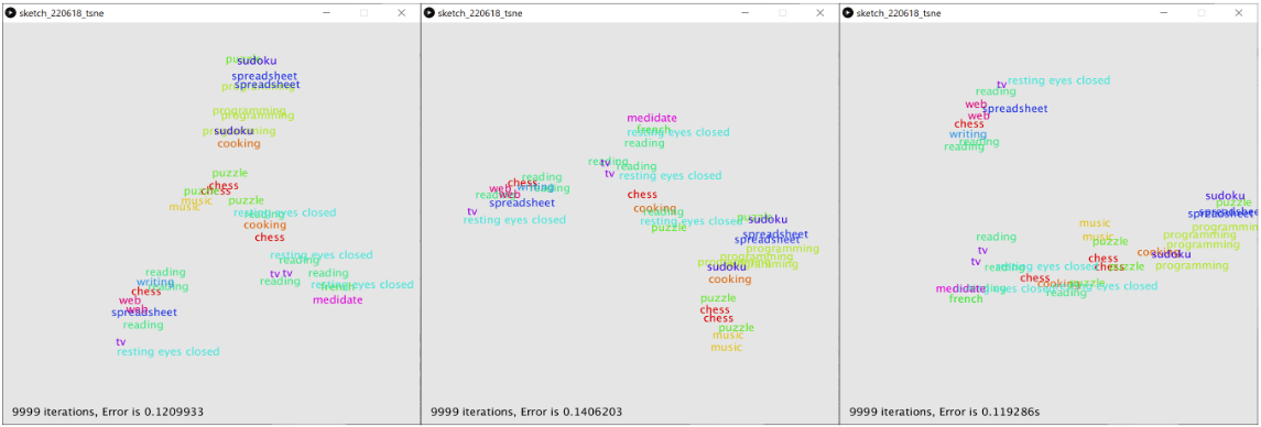 Different outputs of running the same dataset through the t-SNE clustering algorithm.
How reduce 5 dimensions to fewer?
In order to show my datapoints next to each other in a visualization, I need to reduce their 5 brainwave-dimensions down to only 2 or 3 dimensions.
Dimensionality Reduction for Data Visualization: PCA vs TSNE vs UMAP vs LDA is a good summary of different techniques. I wanted to try out t-SNE (T-distributed stochastic neighbour embedding) which is a statistical machine learning algorithm that learns to model down higher-dimension data into fewer dimensions with the goal of clustering datapoints with high similarity.
I found a java library that I could easily use in a Processing sketch.
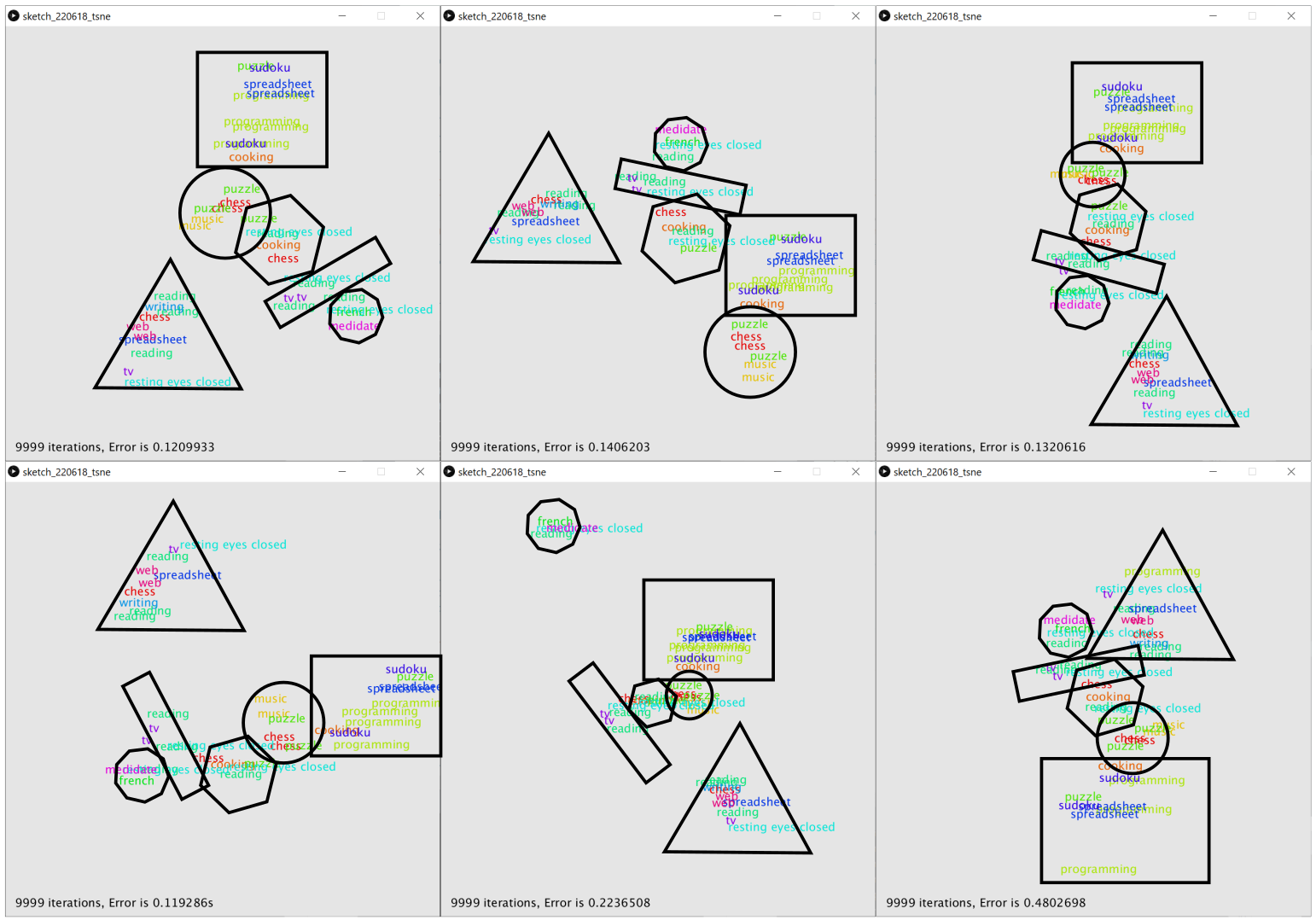 Me assigning shapes to the same clusters of activities that appear in every run, just in different locations.
The results weren’t that exciting, as each time I ran the algorithm, I ended up with a different 2-dimensional configuration at the end. On first glance it seems that the activities are spread out rather randomly, but that’s deceptive. Certain datapoints always end up next to each other. Like all activities tagged programming, so that makes sense. But, more often repeated clusters are a mix of several activities.
The colors in the sketch were assigned by activity. Which now gives the impression that the clusters the algorithm came up with are rather chaotic. In theory the output of the algorithm would now allow me to assign meta-tags to those new groupings.
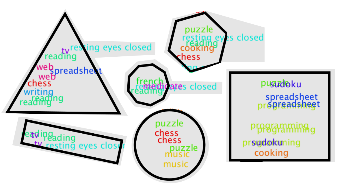 Me assigning shapes to the same clusters of activities that appear in every run, just in different locations.
Does that mean these 6 repeated clusters are the six different mind states I captured with my 40 datapoints? Even though 3 of those mind “shapes” contain the activity of me playing chess? Or does this mean that the t-SNE algorithm tries too hard to force my activities into clusters, and the output is an image of the algorithm at work, rather than of my data?
I think there are multiple faults here. Foremost, I don’t have a large dataset, I only have ~40 measurements. Then, obviously, the measurements are noisy. In addition, who’s to say that playing sudoku one day even puts me in the same state of mind as playing sudoku the week before?
How to add live input?
I also then realized that the t-SNE algorithm wouldn’t even allow me to add live-EEG datapoints to the existing map. There’s no reverse-algorithm that would allow me to place new 5-dimensional data into a particular clustered 2D map. And if I’d recompute the map new at every frame, the landscape would constantly change.
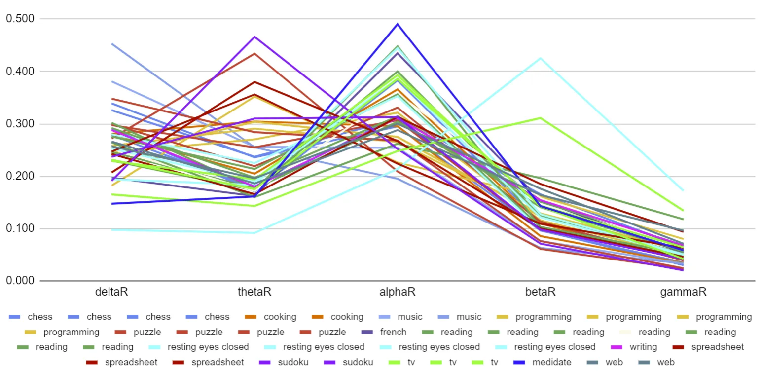 A simple line graph showing all my datapoints and their five dimension on top of each other.
Simply pick 3 dimensions
Instead of using a complicated algorithm, I then decided I would simply look at my data and decide myself which dimensions to use for a more straightforward visualization.
The graph above shows how the Beta and Gamma numbers have a linear relationship between them, with Gamma values being a slightly smaller-scaled version of Beta.
To verify this further, I made these scatterplots, which map each of the 5 brainwave dimensions to each other.
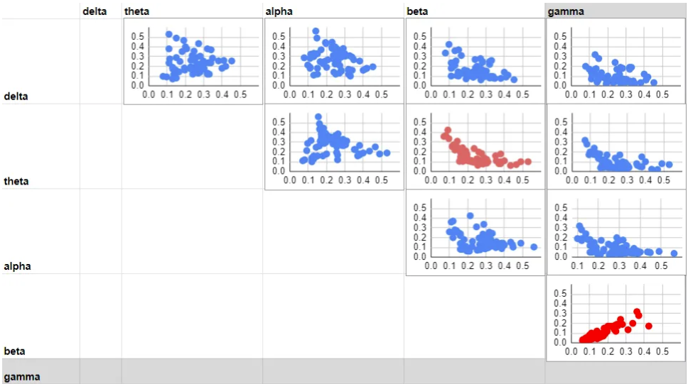 A grid mapping all frequency bands to each other. First row maps Delta to Theta, Delta to Alpha, Delta to Beat, Delta to Gamma.
You can see how Beta mapped against Gamma (red graph in bottom right corner) produces dots along a pretty linear incline. And I also discovered a somewhat linear inverse relationship between Theta and Beta (dimmer red graph in the center).
By choosing Delta, Theta and Alpha as my 3 dimensions for the visualization, I am operating under the assumption that a lot of the Gamma information is encoded in Beta, and a lot of the Beta information is encoded in Theta. Obviously this is pretty rash, but it felt like the most logical elimination.
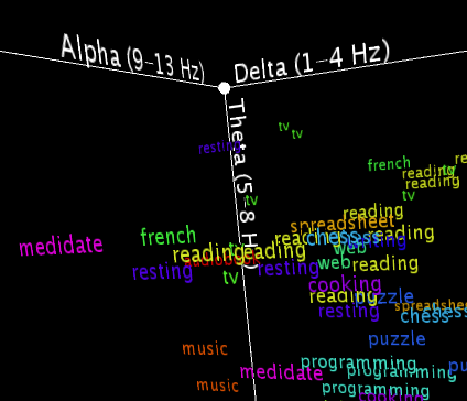
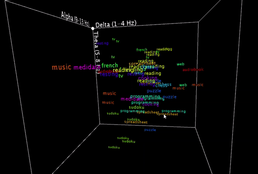 Displaying my datapoints in 3D space, with Delta waves mapped to the x-axis, Theta waves mapped to the y-axis, and Alpha waves mapped to the z-axis.
Placing them in 3D
Now that I’m down to only 3 dimensions, it was pretty easy to simply draw the datapoints as objects in 3D space with Processing. By rotating the resulting word-cloud, and clicking certain activities on and off, this turned into a quite intuitive tool for exploring the relationship between the individual data points. They are not forced into clusters, but are simply displayed according to their numeric values.
 To be honest, these are basically my brainwaves while I’m staring at the computer recording this video, having set the smoothing value pretty low, so that it would hit multiple different nearest neighbors in a row for a more exciting output .
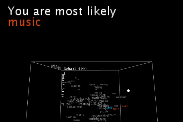
Live input
To now also get live EEG data into this sketch, I am using the Mind Monitor app on the phone (which has been super reliable in the past, especially since Muse has discontinued their own developer tools) to stream the data with OSC to my laptop.
I’m smoothing the incoming brainwave data, and you see the live input as the white dot moving inside the word cloud. An algorithm is then picking the one or two closest neighbors (still calculated with all 5 brainwave dimensions, and not just the 3 visible ones!) and gives a simple (grammatically-not-correct) text output.
-
To sum up, I’ve managed to build the tool I wanted to build. It visualizes EEG datapoints and maps live EEG data to those prerecorded activities it resembles the most.
Now, does it truly tell me what I’m doing? — Well, not exactly :)
Does getting feedback about your current state of mind change your current state of mind? — Yes.
Would a lot more datapoints and patience make the output of this a lot more interesting? — Absolutely!